US Airline delay visualisation
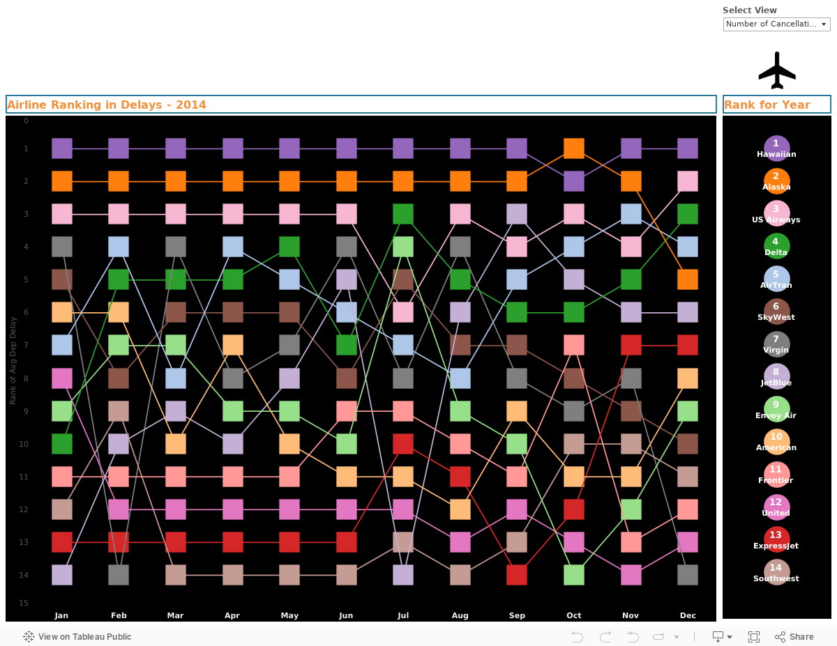
A neat visualisation ranking US airline in terms of number of delays.
In the top section, we are able to select key views to focus on. This can be done using the “Select View” drop down menu. We can choose between number of flights, number of cancellations and distance flown. The dashed red line is the average through out the year.
The meat of this visualisation is ranking each airline on the number of delays by months. I felt this was quite an interesting way of presenting the data. Easy to follow and looks pretty unique.